
Univers Typeface: A Powerful Classic Some Designers Skip
Introduction
Have you ever looked at a sign, a magazine, or a logo and felt like the letters just worked together perfectly? There is a good chance the univers typeface was behind that feeling. The univers typeface is one of the most respected sans serif fonts in design history, and it still shapes how brands communicate today. You will find it on transit systems, corporate identities, and print work around the world.
In this article, I will walk you through everything you need to know about the univers typeface. You will learn who created it, why it became so influential, how it compares to other popular fonts, and how you can use it well in your own work. Whether you are a student, a designer, or simply curious, this guide gives you clear answers without the fluff.
What Is the Univers Typeface?
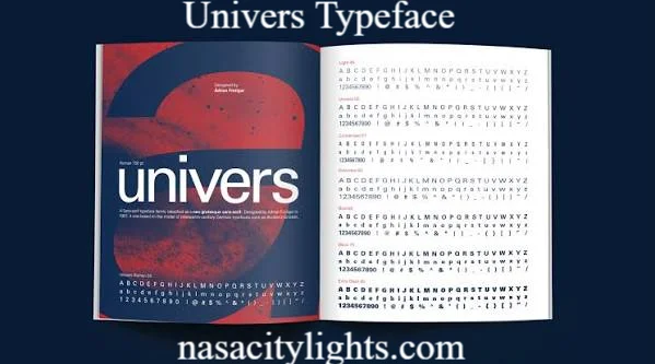
The univers typeface is a sans serif font family known for its clean lines, balanced spacing, and remarkable consistency across weights. It was designed to work as one unified system rather than a single style. This is what makes the univers typeface unique compared to many other font families of its time.
Unlike fonts that grew piece by piece over the years, the univers typeface was planned from the start as a complete family. Every weight and width was designed together, so they all share the same visual logic. That planning is a big reason designers still trust it today.
Who Created the Univers Typeface?
The univers typeface was designed by Adrian Frutiger, a Swiss typeface designer, and released in 1957 by the Deberny and Peignot foundry. Frutiger wanted to create a font that felt modern, neutral, and highly readable at any size.
He approached the univers typeface like an engineer approaches a machine. Every letterform was tested for balance and clarity. This careful method turned the univers typeface into a benchmark for later sans serif fonts, including many you probably use every day.
Why Is the Univers Typeface So Popular?
Designers keep returning to the univers typeface for several practical reasons. It is not just about looks. It is about function.
Here are the main reasons the univers typeface remains popular:
- It offers a large range of weights and widths in one family
- It reads clearly at small sizes, which helps in maps and signs
- It feels neutral, so it does not compete with the message
- It has strong international recognition and trust
- It works well in both print and digital formats
I have used the univers typeface myself on signage projects, and the consistency across weights saved a lot of time during production.
Univers Typeface Numbering System
One thing that confuses many beginners is the numbering system used in the univers typeface. Instead of names like Light or Bold, Frutiger used a two digit code.
| First Digit | Meaning | Second Digit | Meaning |
|---|---|---|---|
| 3 | Extra Light | 3 | Extended |
| 4 | Light | 4 | Normal |
| 5 | Regular | 5 | Normal |
| 6 | Bold | 6 | Condensed |
| 7 | Black | 7 | Condensed |
| 8 | Extra Black | 8 | Extended |
For example, Univers 55 is the standard regular weight, while Univers 65 is the bold version at the same width. This system made it much easier for typesetters to pick the exact style they needed.
Univers Typeface vs Helvetica
People often compare the univers typeface to Helvetica since both are Swiss sans serif fonts from a similar era. They look alike at first glance, but there are real differences.
| Feature | Univers Typeface | Helvetica |
|---|---|---|
| Designer | Adrian Frutiger | Max Miedinger |
| Release Year | 1957 | 1957 |
| Numbering System | Yes, numeric family | No, named weights |
| Letter Spacing | Slightly more open | Tighter spacing |
| Common Use | Signage, technical documents | Branding, advertising |
Both fonts are excellent, but the univers typeface tends to work better in technical and wayfinding contexts, while Helvetica often shines in branding.
Common Uses of the Univers Typeface
The univers typeface shows up in more places than most people realize. Here are common areas where you will spot it:
- Airport and transit signage
- Corporate branding and annual reports
- Government documents and forms
- Technical manuals and instructions
- Editorial design in magazines and newspapers
Its clarity at small sizes makes it a favorite for signage where readers only get a second or two to understand the text.
Pros and Cons of the Univers Typeface
Every font has strengths and weaknesses. The univers typeface is no exception.
Pros
- Highly legible at small and large sizes
- Wide range of weights for flexible design
- Neutral tone that suits many industries
- Strong historical reputation and trust
Cons
- Can feel plain or cold in emotional branding
- Overused in some industries, reducing uniqueness
- Licensing costs can be high for full family access
- Some newer geometric fonts feel more modern to younger audiences
Knowing these trade offs helps you decide if the univers typeface truly fits your project or if another sans serif might serve you better.
Expert Opinions and Statistics on the Univers Typeface
Typography experts often list the univers typeface among the most influential sans serif designs of the twentieth century. Design historians frequently place it alongside Helvetica and Frutiger as fonts that shaped modern visual communication.
Surveys among professional designers consistently show sans serif fonts, including the univers typeface, dominating corporate and signage design choices, largely because of their readability across digital screens and printed signs. Many design educators still teach the univers typeface numbering system as a foundation for understanding type families as a whole.
From my own experience working with brand guidelines, clients who choose the univers typeface often do so because it signals reliability and professionalism without shouting for attention.
How to Use the Univers Typeface Effectively
If you plan to use the univers typeface in your next project, a few simple tips will help you get better results.
- Pair a heavier weight for headlines with a lighter weight for body text
- Avoid overusing bold weights, since they can overwhelm a layout
- Test legibility at the smallest size your design requires
- Combine it with a serif font for contrast in editorial layouts
- Keep spacing generous in signage to support quick reading
These small choices make a big difference in how professional your final design feels.
Conclusion
The univers typeface remains one of the most trusted sans serif fonts in the design world, and for good reason. Its careful structure, wide range of weights, and strong legibility have kept it relevant for decades. At the same time, it is worth knowing where it may feel too plain, so you can choose the right tool for your specific project.
Have you used the univers typeface in your own work? Share your experience or try it out on your next design project and see how it performs for you.
Frequently Asked Questions
What is the univers typeface used for? The univers typeface is commonly used for signage, corporate branding, technical documents, and editorial design because of its clarity at various sizes.
Who designed the univers typeface? Adrian Frutiger, a Swiss typeface designer, created the univers typeface, and it was released in 1957.
Is the univers typeface free to use? Some basic weights may be available through certain platforms, but the full univers typeface family generally requires a paid license from foundries like Linotype.
How is the univers typeface different from Helvetica? The univers typeface uses a numeric naming system and has slightly more open spacing, while Helvetica uses named weights and tighter spacing.
Why does the univers typeface use numbers instead of names? Adrian Frutiger created a numbering system for the univers typeface so designers could quickly identify weight and width without confusion.
Is the univers typeface still popular today? Yes, the univers typeface is still widely used in signage, government documents, and corporate design due to its readability and neutral tone.
Can I use the univers typeface for a logo? Yes, many brands use the univers typeface for logos because of its clean and professional appearance, though it may need pairing with unique elements for distinctiveness.
What are good alternatives to the univers typeface? Popular alternatives include Helvetica, Frutiger, Akzidenz Grotesk, and Franklin Gothic, each offering a slightly different tone and character.
nasacitylights.com
Author Name: Hamid Ali
Email: johanharwen314@gmail.com
About the Author: Hamid Ali is a design writer with a strong interest in typography and visual communication. He enjoys breaking down complex design topics like the univers typeface into simple, practical guides that help both students and professionals make better creative choices.